Description
Page.5
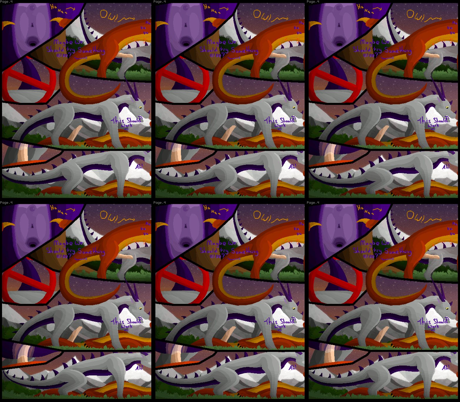
Here be the fourth page, this time with a much improved layout. Still isn't the best thing out there, but a vast improvement, I'm sure everyone would agree. The extra room created as well gave me space to spice up the text a little. I think the readability has suffered a little, especially the purple-ish text, but it's good enough for this. The remaining page, I'll create in the same fashion. It'll be shorter because I've found myself with some more free time and wish to work on a bigger project, like my older animated videos, but to slightly improved quality of these comics.
On the note of quality, I keep letting the "shrinking" of the tail past my initial sketches of the animations, somehow. Sorry about that, noticed it too late.

playeer
MemberI personally dont mind it
kinda gives me the feel that the tail is wagging ;P
ThornyBush
MemberHaha, with that in my mind now maybe it won't look so bad to me!
Login to respond »