Description
Page.1
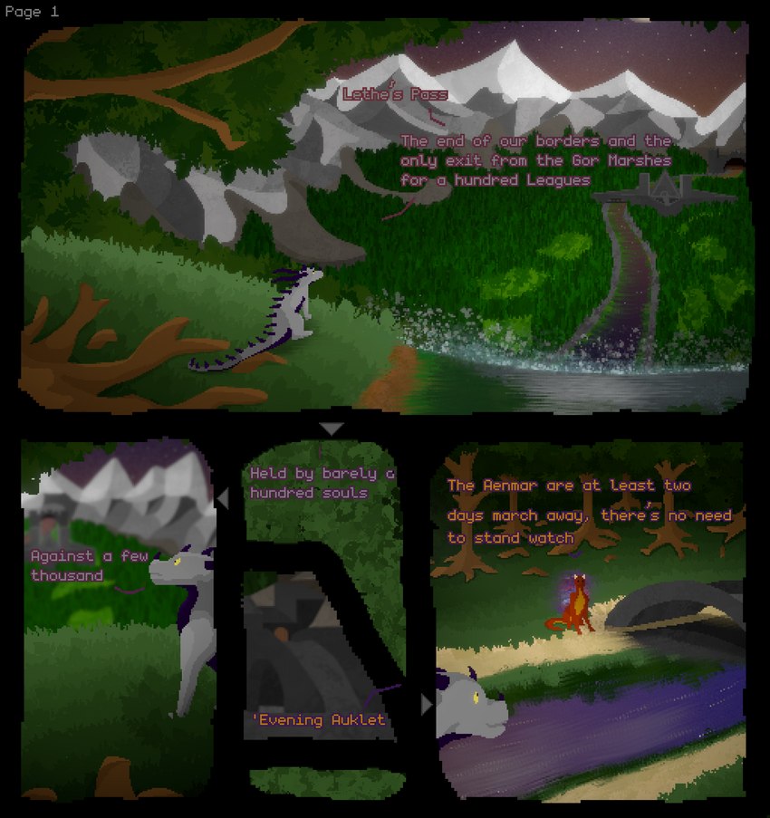
And here is the first page of that short, slightly 'animated' (obviously not this page) comic I mentioned. This is basically where I ended up finalising the style I'm using throughout the rest of the comic, so it's a little rough around the edges.. Espeically that 4th frame, which I've even blurred because I hate it so much. I would of spent more time on it... but this was only supposed to be something I was doing on the side so never ended up getting around to it, The layout is also not amazing either, but it's my first time trying to stylise my work into a comic.
Also, if anyone does end up seeing this, I'd like to know someones opinion on the readibility of the text. I had a look around the place and couldn't see many examples for pixel-art writing, espeically one's that'd fit in with less-simple backgrounds. The current result is what I ended up thinking was best of readibility and clarity of who was speaking. The font is 'monogram' for anybody that's curious.
There's a story behind whats going on here, but considering this is going to be about five pages in length there's not going to be much delve into it beyond the first two pages. I may end up going further into it with future comic-style uploads, but consdiering the time investment, I'm not sure about how I'd even start with that. They say a picture tells a thousand words, but thats not reversable. It seems to take a few thousand pictures to tell a chapter of a story.

Sciliant
MemberFantastic work on that landscape!
Login to respond »