Description
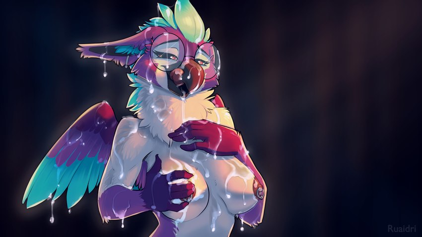
Aias gets GLAZED
I had some ideas for how to maybe make these look a touch better- the biggest one being lightening up on the fur detail a bit, keeping the texture a little more simplified. All that fluff look decent on it's own, but once you pile on a dumptruck of cum it gets a bit visually noisy, so I've scaled it back a bit here. I've also lightened things up overall, and I think the result is pretty good!
Also, I got to give a gryphon a good glazing and that's always good fun, so all in all I'm pretty pleased with this one. What do y'all think?
For Aias_Gryphon

sunRay04
Memberok, these are cool and all, but at this point id like something else, please.
SkillKat99
MemberLovely! Love the combo of glasses and nipple rings! ^^
She better get to work cleaning all the spunk off her feathers, with her tongue, before it dries! :P
Updated
Sloppysludger66
MemberHoly shit no way. After all these years, my older brother, Rykida, says he used to host your content on his server way back in the day. And now I tell him your my favorite artist and he drops that on me. Thank you. For being here.
Schizzo
MemberSure hope this character gets featured, she's cute
NMontana
MemberWhere are we getting all this cum from? I hope it's not one person, the poor guy is gonna be so dehydrated!
lurkingfox
MemberHmm... About the style choices in description: To me the "visual noise" feels inherent to the desired effect, like the character getting immersed into the mess, and it visually draws the viewer in to look closer.Aesthetically/artistically I can see the argument for simplification for clarity, but it makes it a different thing too. (It may also be a display scale thing too - the thumbnail definitely pops more.)
Login to respond »